I'm Tired of This
Spotify knows what you like. It doesn't know when you're sick of it. A design sprint on music discovery, run against a brief from Spotify's music team.
The Brief
Alex Freeman from Spotify's music team ran the sprint. His challenge:
How might Spotify better serve music discovery using AI, on new or existing surfaces, based on both implicit and explicit signals?
He spent a good chunk of the lecture on something else though. Dark patterns, humane product development, and the idea that trust takes a long time to build and no time at all to break.
We took that part seriously. It ended up shaping our answer more than the AI part did.
The User We Picked
Comfort listeners. They loop the same playlist for months. They rarely open discovery because discovery feels like homework. Then one day every song they own sounds tired, and they still don't know where to start.
Spotify has plenty of discovery surfaces. Comfort listeners walk past all of them.
How might we make music discovery less overwhelming for comfort listeners who are tired of their usual playlist?
The Reframe
The lecture treated signals as a way to learn what people like. We used them to work out when someone is bored. Spotify already collects almost everything you need for this. It just reads it as taste.
Implicit signals of fatigue
- Time spent inside a playlist dropping off
- A go-to playlist getting opened less often
- The same few songs on repeat, past the point of enjoyment
- An artist fixation fading
Explicit signals of fatigue
- Skips clustering together instead of scattering
- Rewinds, which mean the opposite
- An "I'm tired of this" button, which doesn't exist today
Fatigue is a signal. Nobody was listening to it.
The Prototype
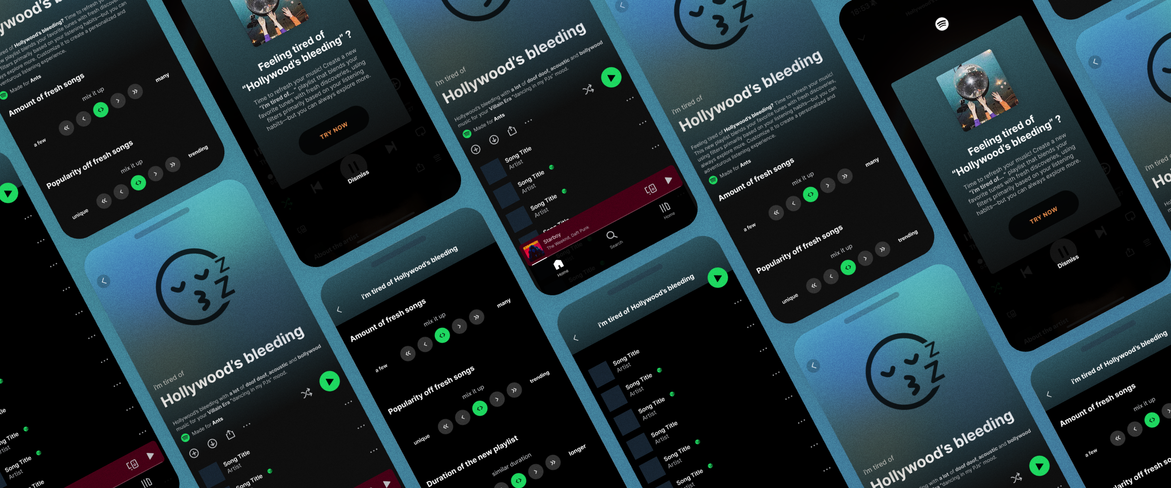
I built it in Figma, on top of real Spotify screenshots, so the flow sits inside the product instead of next to it.
1. Detection
Hollywood's bleeding, third time this week. The user is skipping through their own playlist: Drama, then Lose Control, then Get Lucky. Three skips, none of them land. The skips cluster instead of scattering, and the system reads it.
2. The Prompt
"Feeling tired of Hollywood's bleeding?" Try Now, or Dismiss.
We wrote it as a question on purpose. Telling someone their taste has gone stale is a fast way to lose them. The system has a hypothesis, so it asks. It doesn't announce.
This is also the only place discovery shows up. No new tab, no permanent surface, no nudge sitting in the nav asking to be noticed. It appears when the user's own behaviour asks for it, and it goes away when they say no.
3. The Manual Door
Detection won't always be first. Sometimes you know you're bored before the system does.
So the same action lives in the playlist's own context menu, one row above Spotify's existing "Exclude from your taste profile." That is the same negative signal, collected and then thrown away. We pointed it at something useful instead.
4. Refine
How many fresh songs. How obscure or trending they are. How long the playlist runs. Then mood and genre, as chips: Main Character Energy, Villain Era, Dancing in my PJs.
The defaults matter more than the controls do. A comfort listener can hit generate without touching anything and still get something sane back. The sliders are there for people who want them, not demanded from people who don't.
That was the whole point. The premise is that this user finds discovery overwhelming. Handing them a settings panel and calling it a solution would have missed it.
5. The Result
"i'm tired of Hollywood's bleeding." Named after what it replaces, so the comfort anchor survives.
The description spells out what it did, in plain language: a lot of doof doof, some acoustic, some bollywood, for a Villain Era, dancing in my PJs mood. New songs carry a badge, so you can see what arrived and what you kept.
6. The Loop
Fatigue comes back, so the exit is a loop, not a one-shot. The same menu slot becomes "Refine this playlist," and the new playlist takes its place on Home.
What We'd Fix
The icon is doing two jobs, and it shows
The sleepy face is borrowed from Spotify's Smart Shuffle and Suggested labels, so it fits the brand. But the sentiment in it is negative, and we used it to mark the fresh songs. A user could reasonably read that badge as "here are the ones you're sick of." The mark for what's new shouldn't be the mark for what's tired. That's a straight fix, and we didn't catch it in time.
Mood chips assume a vocabulary
Villain Era is fun. It also assumes people think about listening in mood terms, and comfort listeners are the group least likely to.
Detection was simulated
The skip cluster fires the prompt in Figma because we told it to. We never tested the threshold, and a false positive is expensive here. Interrupt someone who is perfectly happy and the whole thing reads as an accusation.
This is a concept from a one-week sprint. It wasn't user tested, and I'm not going to pretend otherwise.
What I Took From It
The best idea in this project came from listening to the client's aside instead of his headline. The brief said AI. The lecture said don't manipulate people. The interesting design sat in the second one.
Discovery UX usually competes for attention. This one waits to be needed. That's a smaller idea and a better one, and it's the thing I still think about when I design anything that wants to interrupt someone.
Credits
Group project with Ina, Nauvya and Elin. I built the prototype and presented it. Brief and lecture by Alex Freeman, Spotify.